历史 - Grid
The platform includes predefined widgets that facilitate data presentation in dashboards. Among them are the history and comparative history widgets.
They allow viewing the evolution of 端点 measurements over time.
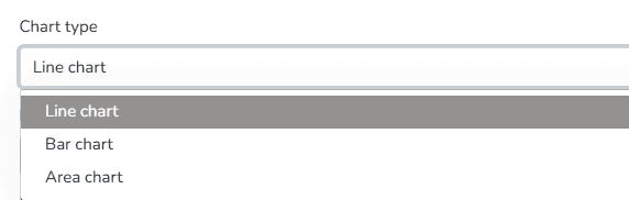
Among the display options for this widget, you can 选择 the chart type for data visualization: line, bar, or area format.
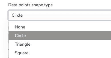
You can also choose the Data Point Shape Type from the following options: Circle, Triangle, Square, or none.
Additionally, you can set the orientation of the chart grid lines. Available options include Horizontal, Vertical, or Both.
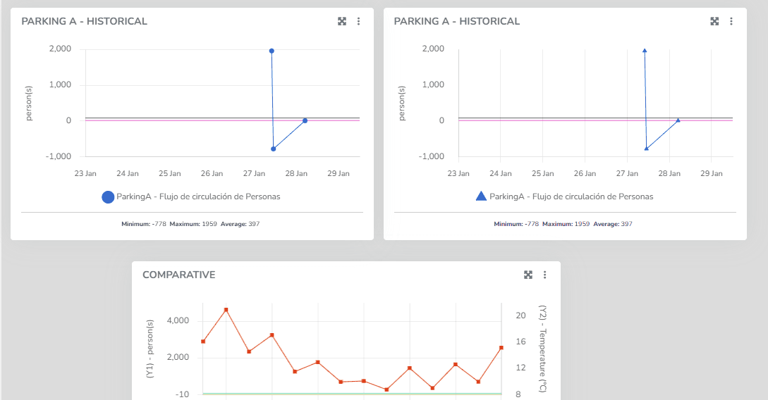
These features are available for both the 历史 widget and the Comparative 历史 widget. In the latter, the same chart can display measurements for two different variable types, one per axis.
最后更新于
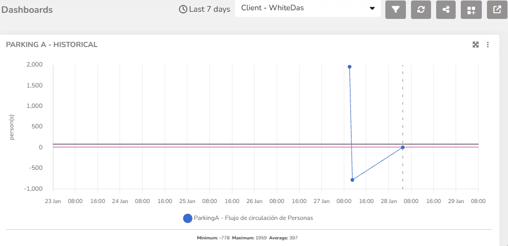
历史
Line chart showing the variation of an endpoint variable type over time. In endpoint history charts, the user can 输入 minimum and maximum values to define the Y-axis ranges, as well as modify the variable names associated with the Y-axis titles.
历史 - 粒度
State granularity is a feature that allows users to adjust the level of detail at which device state measurements are presented. This control over granularity provides crucial flexibility for monitoring, as users can choose how data is presented based on the context and analysis needs.