历史
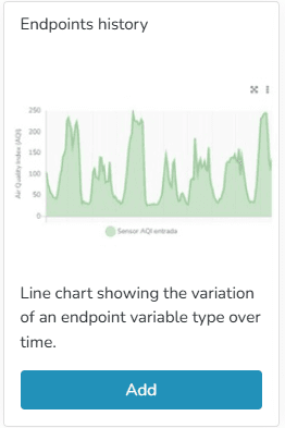
Line chart showing the variation of an endpoint variable type over time. In endpoint history charts, the user can 输入 minimum and maximum values to define the Y-axis ranges, as well as modify the variable names associated with the Y-axis titles.
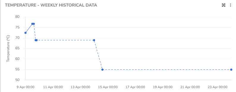
You can view information corresponding to states when the 端点 was connected, as well as when it was disconnected. You can choose to display the grid line direction, endpoint labels, minimum/maximum/average values, use custom colors, and apply the available filters.
The user can organize the information and visualization of these charts through different criteria within the 小部件:
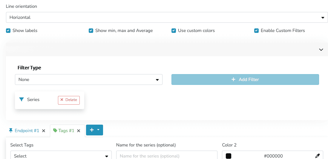
- Grid line orientation: Horizontal/Vertical/Both
- Labels for naming series
- Show or hide Maximum/Minimum/Average values
- Custom colors
- Custom filters
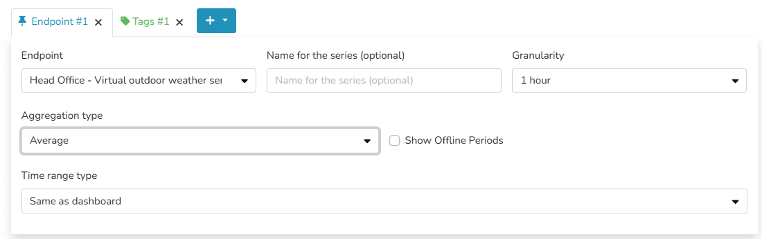
- 粒度
- 聚合
- 断开连接时间
- Time range: this can match the dashboard's time range or be a different time range, specifying the dates to be viewed in this widget.
You can choose to display information either by identifying one or more endpoints of the same type, or by labels associated with those endpoints.
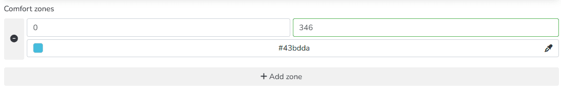
Additionally, t此处 is an option to define different Comfort Zones within the allowed value ranges for the endpoint.
最后更新于
设备小部件
The user can use this 小部件 to view relevant information about a specific device, as well as data from up to 2 of its endpoints.
历史 - Grid
The platform includes predefined widgets that facilitate data presentation in dashboards. Among them are the history and comparative history widgets. They allow viewing the evolution of 端点 measurements over time.